Pain Ink Rebrands Itself and Moves To WordPress to Expand Its Reach
Of all the design projects I’ve worked on, the one for Pain Ink Productions represents the most diverse. It also happens to be my favorite.
Pain Ink Productions is a small e-commerce retailer of t-shirts and athletic apparel appealing to the urban lifestyle. It also doubles as a hub for discovering and developing creative talent in music and spoken word poetry. They approached me to help redefine their brand identity and to move the company’s website away from Wix to self-hosted WordPress.
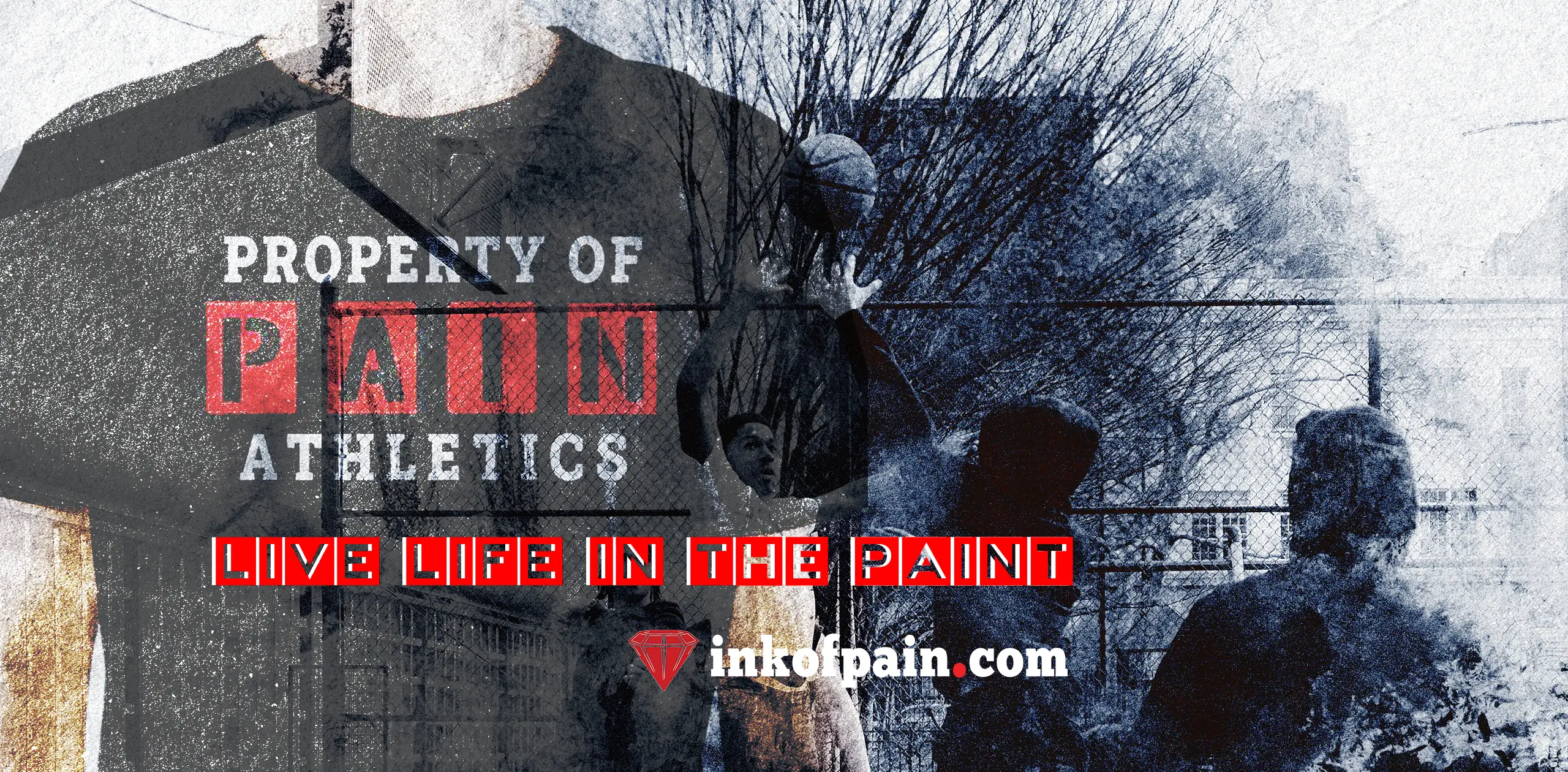
Brand refinement involved centering designs around distinct, recognizable imagery and creating aesthetics identifying with the “on-the-grind” lifestyle. It was necessary to construct a new website with custom layouts focused on easier navigation and a WooCommerce store with better product presentation. The completed work consists of multiple revised logo versions, taglines, brand guidelines, images, video content, a blog, and a YouTube channel. Taking advantage of Pain Ink’s substantial social media following, traffic is directed back to the website to increase engagement and boost sales.
Project Deliverables
Design Tools
Of all the design projects I’ve worked on, the one for Pain Ink Production represents the most diverse. It also happens to be my favorite.
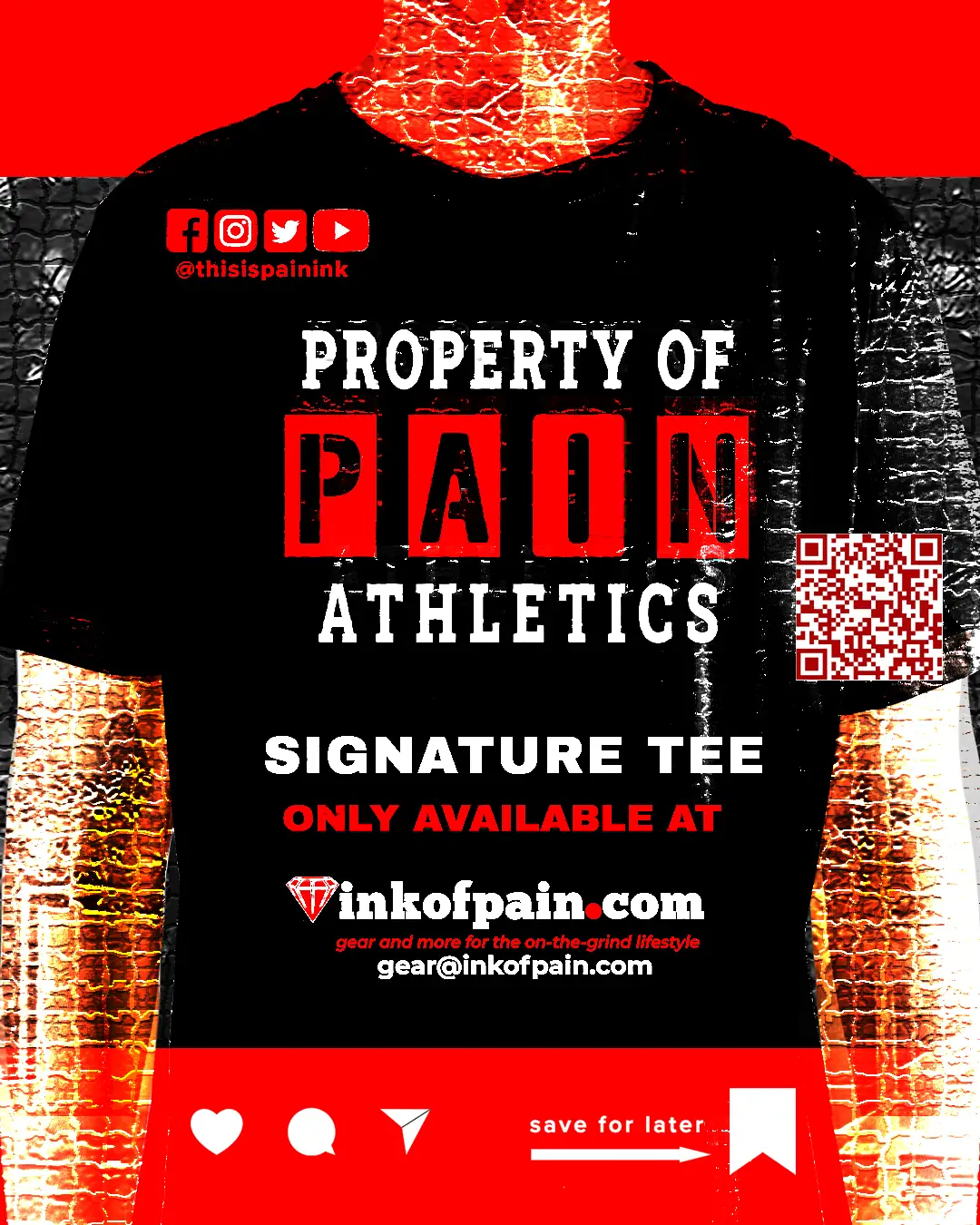
The Pain Ink brand centers around a tri-color primary palette of red, black, and white. I produced multiple versions of the vector logos in color and grayscale for different use cases using Illustrator with the Logo Package Express extension. The inkofpain.com address features prominently in all advertising to drive visitors back to the website. To help brand recognition, we decided to use the @thisispainink handle across all social media channels, including YouTube. The QR code from Linktree is used in all social media bios and content.
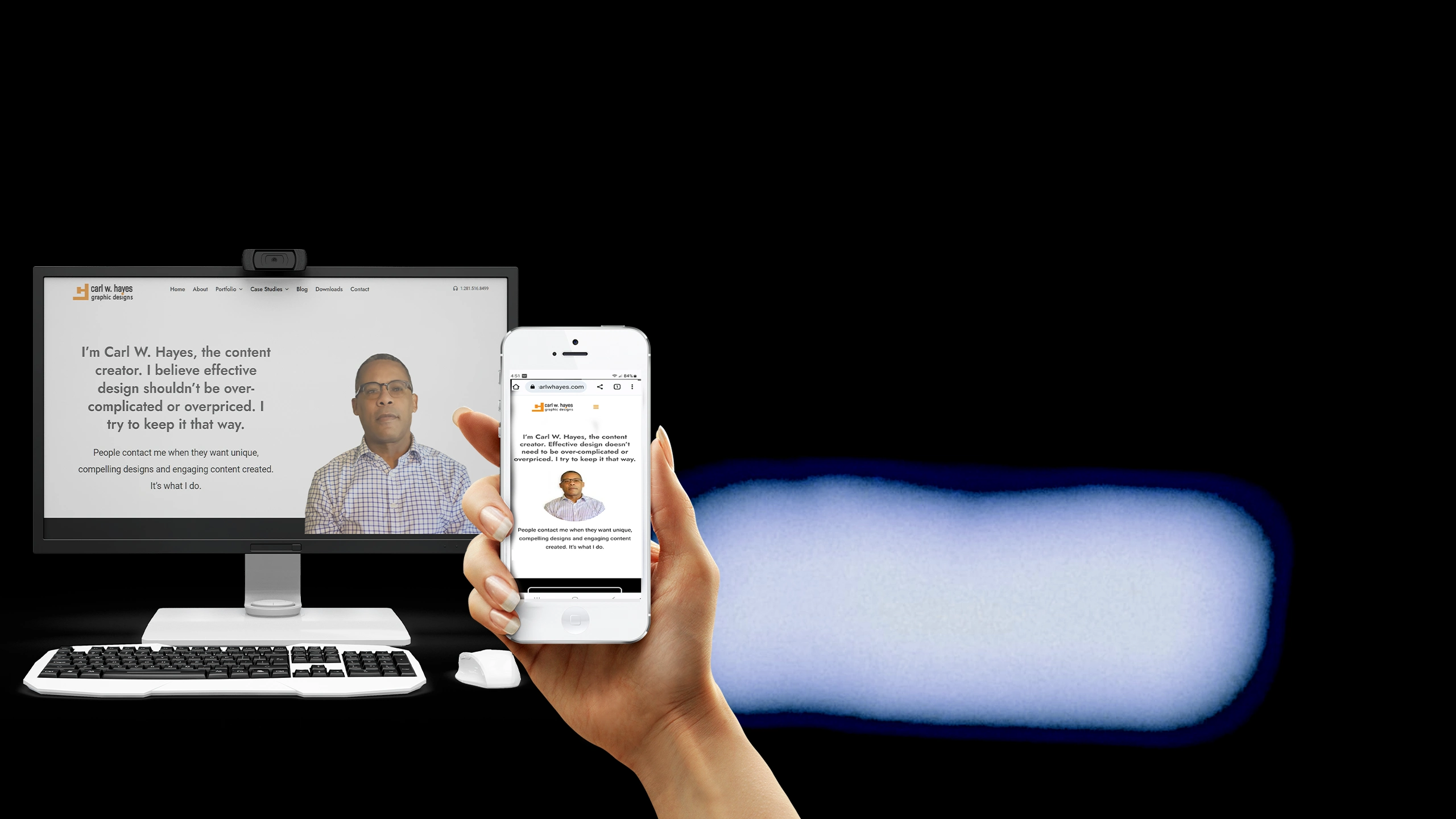
For the website, I picked a template from the Avada library which supported e-commerce and designed custom layouts for the web pages, the gear shop, and the blog. I also created fast-loading text-centric versions for mobile device display.
Using one of Pain’s favorite taglines, “Poetry in Motion,” I designed a video blog which serves as a news center and features interviews with musical artists, poets, and other difference-makers. I produced its video opener to support the tagline, “the playground for storytellers” with Premiere Pro and After Effects. Hosting the site’s video content on Vimeo and YouTube makes it easy to add to the site pages or recycle for social media publication.
Share This Story!
Read Other Case Studies


