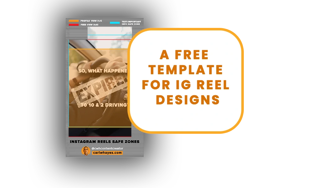
Creating video content on Instagram is something I enjoy. But understanding where to place Reels content so it remains IG’s “safe zones,” is something that frustrated me. Tere’s a lot of variables. Either my reel thumbnails did not fit in the grid view, or the feed view in the Reels cut off some of my text or other design elements, or Instagram’s overlays obscured something in the full-screen view. Obsessed with making reels that displayed better in the Instagram app, I did some research. Most of what I found talked about the issue but provided no visible examples. Using Photoshop, I created my own template overlay with the safe zones clearly marked to eliminate the guesswork. Now, I’m sharing it with you at no cost.
What Are IG’s “Safe Zones”?
The IG “safe zones” might sound like a virtual place where app users might seek shelter against threats, known and unknown. But it’s a lot less serious and at the same time a lot more complex. The safe zones refer to areas safe for design element placement without the app cutting it off or obscuring by the app’s graphic overlays. The IG app crops Reels differently for each app view. The grid, the feed, and the full-screen modes all have different ratios and thus different viewable areas.
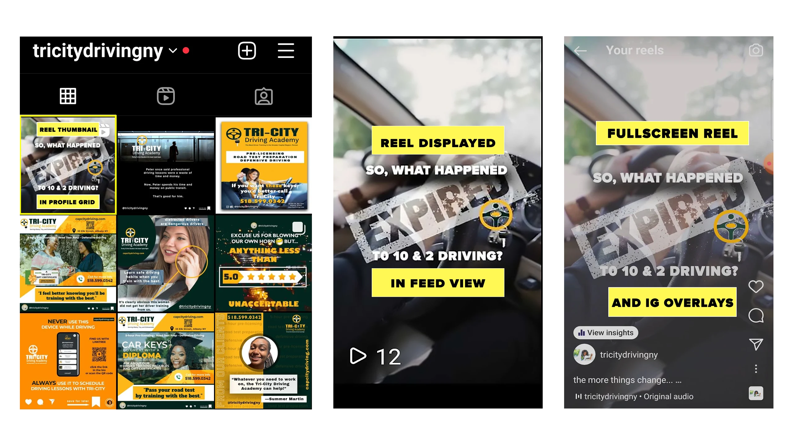
As an example, look at the three images displaying an Instagram Reel I created for my client Tri-City Driving Academy. The first image shows the reel thumbnail in the profile view at a 1:1 square ratio. The second image shows the Reel in the Feed View at a 4:5 portrait ratio. And the last image shows the Reel in full screen mode (9:16 ratio). It also shows the areas occupied by the IG app’s graphic overlays on top, right-side, and bottom. You’ll also notice there is a slight amount of cropping on the right and left sides.
How I Designed My IG Reels Template
I knew I needed my own template but needed more concrete information. I did some research and came across an IG template designed by content creator Jon Loomer. Using his template, I tried it out on footage from my Samsung Galaxy S20. It was a big step in the right direction, but as Loomer stated in his post, his template did not account for the space Instagram allocated to every phone. Still, it gave me something to work with, and I’m grateful for that because it shortened my learning curve. Then I stumbled across a blog post and template from Amplify 11. This provided an illustrated guide for IG’s safe zones specs and proved to be the missing ingredient to my template recipe.
First, I recorded a copy of my client’s reel using a screen recorder app on my phone. After downloading the file to my computer, I saved a screenshot of the title screen and imported the still into Photoshop. I used this as a guide for tracing out the regions occupied by the IG overlays and temporarily filled the region with a white background.
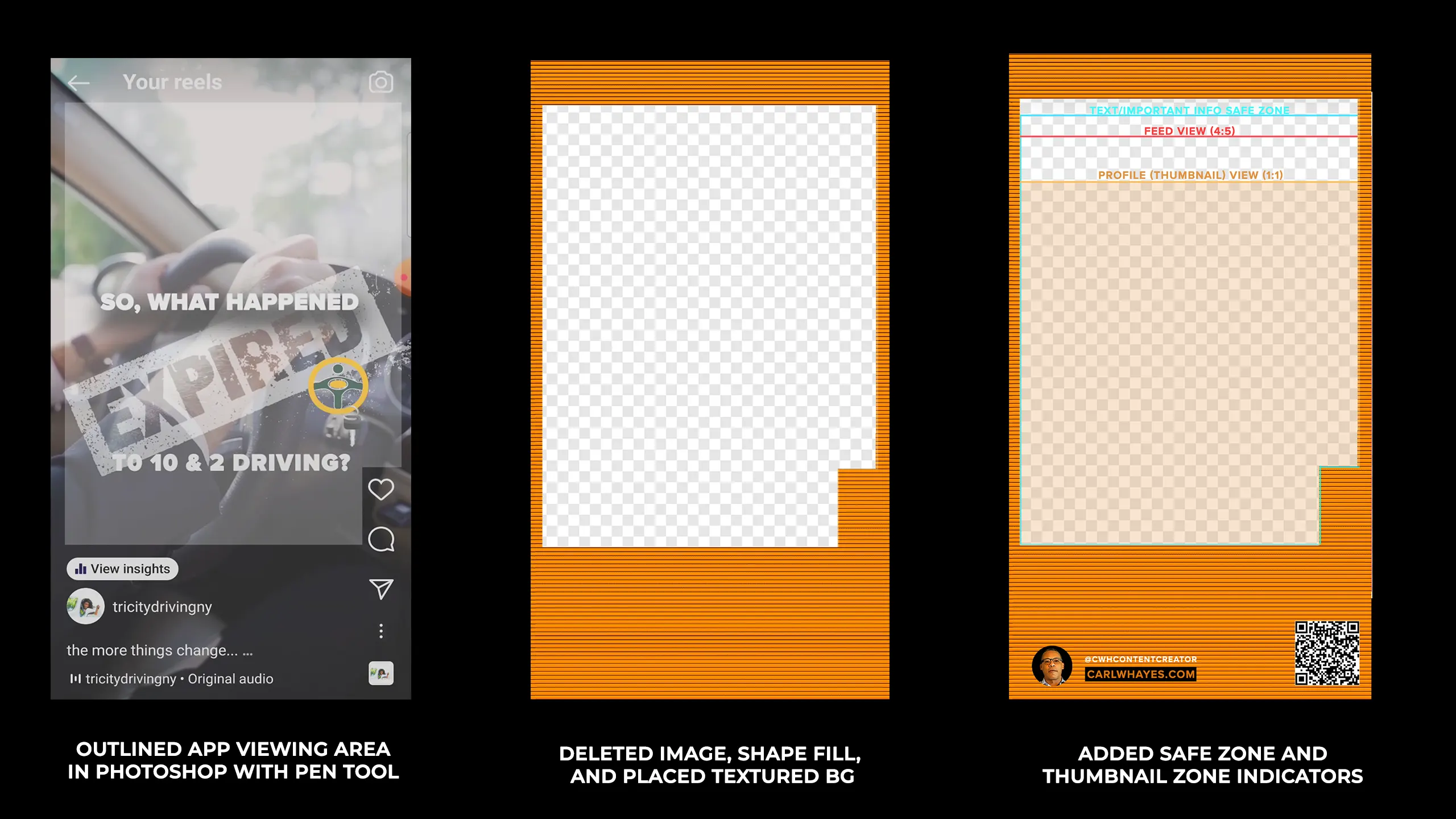
Next, I deleted the image layer and added in a textured background for the template outline. After merging the two layers together, I deleted the white background fill representing the safe zones to give it transparency. The template’s orange-colored-striped region represents the areas reserved for Instagram’s graphic overlays. Finally, I added in the colored safe zone indicators and added text layers. An orange opaque rectangle outlines the thumbnail region which the app uses in the profile grid.
Using The Template to Create a Fresh Reel
I saved my template as a Photoshop file. To test it out, I decided to create a Reel for a real estate agent client. The post will deal with a home-buying savings plan. First, I located a free video on Pexels. For my thumbnail design, I saved a still from the video and imported it into Photoshop, placing it underneath my template and added my title text. Turning off the template layer, I next saved the title screen as a new file and imported it and my separate template file into my Adobe Premiere Pro timeline. I place the template above my thumb and video layers. I already know the thumb is in the right zone, but I need to add some on-screen text. Using the template, I make sure everything is within the proper safe zones. Once I’m done, I turn off the template layer and export my file for uploading to Instagram.
Download your Free Copy
You can download a free copy of my IG Reels Safe Zone Template by clicking the button at the end of the video above or by clicking this link. I hope you find it useful. Drop me a line if you have any questions or suggestions. Also, be sure to read about my social media content packages and check out my portfolio!
Share This Story!
Creating video content on Instagram is something I enjoy. But understanding where to place Reels content so it remains IG’s “safe zones,” is something that frustrated me. Tere’s a lot of variables. Either my reel thumbnails did not fit in the grid view, or the feed view in the Reels cut off some of my text or other design elements, or Instagram’s overlays obscured something in the full-screen view. Obsessed with making reels that displayed better in the Instagram app, I did some research. Most of what I found talked about the issue but provided no visible examples. Using Photoshop, I created my own template overlay with the safe zones clearly marked to eliminate the guesswork. Now, I’m sharing it with you at no cost.
What Are IG’s “Safe Zones”?
The IG “safe zones” might sound like a virtual place where app users might seek shelter against threats, known and unknown. But it’s a lot less serious and at the same time a lot more complex. The safe zones refer to areas safe for design element placement without the app cutting it off or obscuring by the app’s graphic overlays. The IG app crops Reels differently for each app view. The grid, the feed, and the full-screen modes all have different ratios and thus different viewable areas.

As an example, look at the three images displaying an Instagram Reel I created for my client Tri-City Driving Academy. The first image shows the reel thumbnail in the profile view at a 1:1 square ratio. The second image shows the Reel in the Feed View at a 4:5 portrait ratio. And the last image shows the Reel in full screen mode (9:16 ratio). It also shows the areas occupied by the IG app’s graphic overlays on top, right-side, and bottom. You’ll also notice there is a slight amount of cropping on the right and left sides.
How I Designed My IG Reels Template
I knew I needed my own template but needed more concrete information. I did some research and came across an IG template designed by content creator Jon Loomer. Using his template, I tried it out on footage from my Samsung Galaxy S20. It was a big step in the right direction, but as Loomer stated in his post, his template did not account for the space Instagram allocated to every phone. Still, it gave me something to work with, and I’m grateful for that because it shortened my learning curve. Then I stumbled across a blog post and template from Amplify 11. This provided an illustrated guide for IG’s safe zones specs and proved to be the missing ingredient to my template recipe.
First, I recorded a copy of my client’s reel using a screen recorder app on my phone. After downloading the file to my computer, I saved a screenshot of the title screen and imported the still into Photoshop. I used this as a guide for tracing out the regions occupied by the IG overlays and temporarily filled the region with a white background.

Next, I deleted the image layer and added in a textured background for the template outline. After merging the two layers together, I deleted the white background fill representing the safe zones to give it transparency. The template’s orange-colored-striped region represents the areas reserved for Instagram’s graphic overlays. Finally, I added in the colored safe zone indicators and added text layers. An orange opaque rectangle outlines the thumbnail region which the app uses in the profile grid.
Using The Template to Create a Fresh Reel
I saved my template as a Photoshop file. To test it out, I decided to create a Reel for a real estate agent client. The post will deal with a home-buying savings plan. First, I located a free video on Pexels. For my thumbnail design, I saved a still from the video and imported it into Photoshop, placing it underneath my template and added my title text. Turning off the template layer, I next saved the title screen as a new file and imported it and my separate template file into my Adobe Premiere Pro timeline. I place the template above my thumb and video layers. I already know the thumb is in the right zone, but I need to add some on-screen text. Using the template, I make sure everything is within the proper safe zones. Once I’m done, I turn off the template layer and export my file for uploading to Instagram.
Download your Free Copy
You can download a free copy of my IG Reels Safe Zone Template by clicking the button at the end of the video above or by clicking this link. I hope you find it useful. Drop me a line if you have any questions or suggestions. Also, be sure to read about my social media content packages and check out my portfolio!


