

Almost, everyone from actors to actors to musicians to speakers to authors to small business owners and freelancers of all types use this single-page publicity mechanism to promote themselves in a way a business card cannot.
In this post, I examine what a one sheet is, and five design elements it should include, using one of my own as a reference.
So, what is a marketing one-sheet?
A marketing one sheet, also referred to as a one-pager or a sell sheet, is a single page that provides information about your company or a particular product or service. One-sheets are often printed and distributed during sales meetings or trade shows but can also be posted online or distributed electronically.
Because they are intended to offer a brief, but clear picture (think elevator pitch), it pays to keep text to a minimum and incorporate design elements which are within the bounds of your brand identity.
There are 5 essential design elements
There are a minimum of five essential design elements I recommend for inclusion in every marketing one-sheet.
Although you might be tempted to squeeze in more elements such as testimonials (if your business is new, you might not have any credible ones that will carry weight) remember it’s not a novel but a short, well-designed pitch to generate interest.
Now, let’s examine what should go into each design element.
An eye-catching headline
The headline is the first thing your reader will notice. You’ve only got a few seconds to get to the point: why would I want to use you to do whatever it is you say you do? Get it wrong and you might lose your reader and the chance to schedule a future meeting.
A summary of qualifications/benefits
You’ve either handed or delivered the one-sheet electronically to a prospective customer. What happens next takes place in a matter of seconds. As he reads it, he’ll expect to discover quickly what you are promoting—your product, your service, or yourself—in a series of short descriptive paragraphs, consisting of one to two sentences each. Don’t waste a lot of words, which will waste time and cause readers to lose interest.
An easy-to-follow design layout
A marketing one-sheet must be easy to read and have a logical flow to the information it presents. It should also reflect a professional design touch in your choice of imagery and avoid cheap-looking clip art. Make sure the design reflects your brand identity in color and typeface choices. It doesn’t matter what design program or template you use—Microsoft Word, Canva, PowerPoint, Adobe Express, or others. My personal favorite is InDesign (more on that later).
A clear call to action
Next to the title, this is the most important design element on your marketing one-sheet. You’ll want to lead your prospective customer or client to where you want them to go—visit your website, email you, or call you. Use action words to guide them along the way and offer a solution to a problem. Make sure the call to action stands out from the rest of the design elements.
Contact information
Don’t overlook the importance of your contact information being prominently displayed. At a minimum, you’ll want to be sure and include a phone number, email, and website address, if applicable. If you have a physical location, then include the address.
Dissecting my one-sheet design
So, let’s put theory into practice. I’ll use one of my marketing one-sheets I created using InDesign and analyze the design elements I discussed above.
As I discussed in a previous post, by using InDesign, I have the option of exporting for print and digital without a lot of fuss, saving me valuable time.
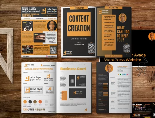
click image to view/download larger image
For the sake of putting theory into practice, let’s analyze the marketing one-sheet I created using InDesign. As I discussed in a previous post, using InDesign offers me the option of exporting for print and digital without too much fuss, saving me valuable time.
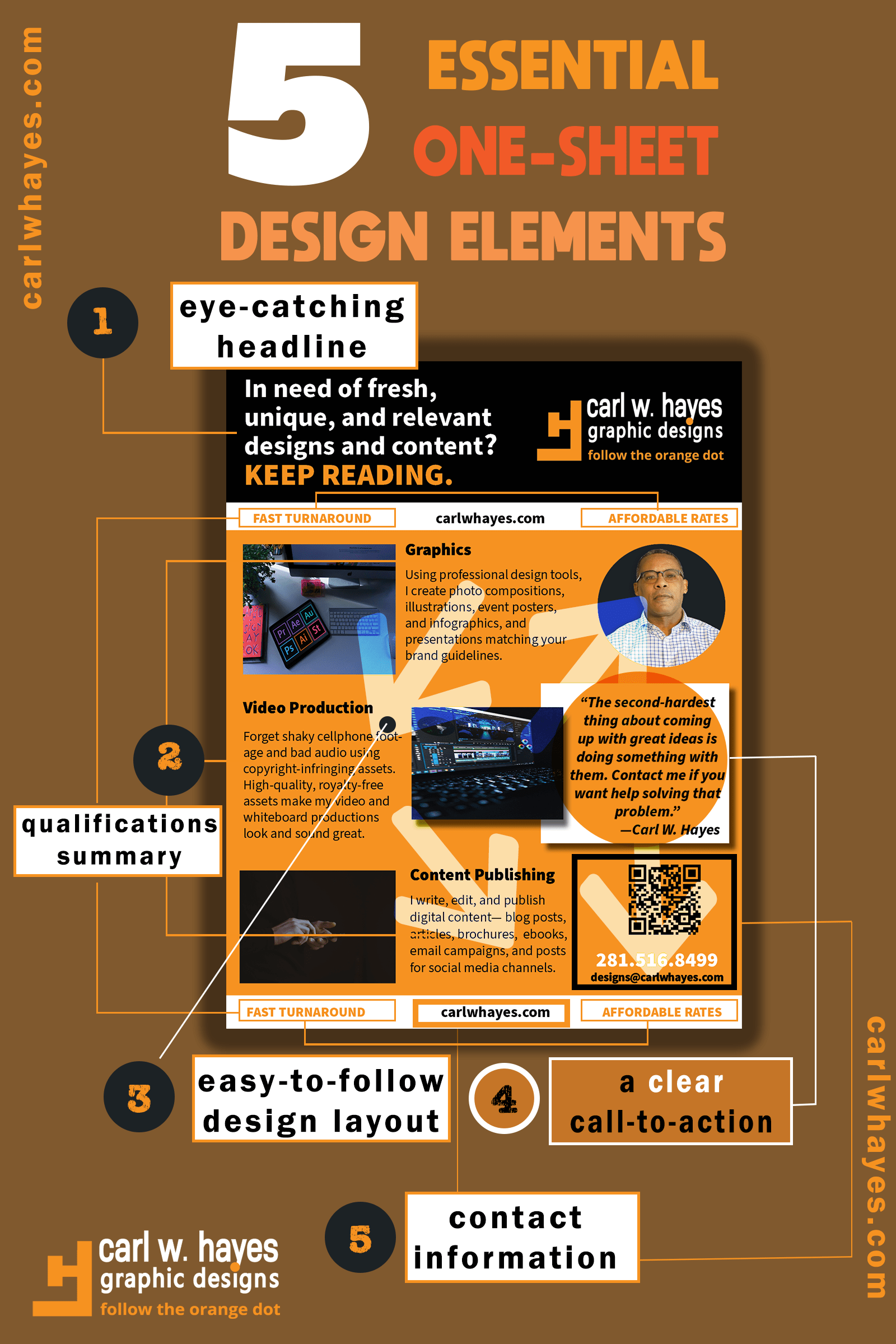
First, I presented my eye-catching headline in the form of a question/answer with a strong hint of suggestion: KEEP READING.
Next, I summarized my qualifications in three short paragraphs, accompanied by three professional stock photographs to give visual cues to the design services I promoted—graphic design, video production, and content publishing. Each service description includes no more than two sentences. In the white space below the header section and in the footer, I plugged in two snippets describing the quality of my services (Fast Turnaround and Affordable Rates).
My choice of a vertical design layout worked well because it makes it easier to read on paper and on multiple screen sizes. The designs followed a top-to-bottom, left-to-right reading order directing viewers to my call-to-action and my contact information on the document’s right side. It also followed my brand color palette which included shades of orange, black, and white, offering nice contrast for my logo and tagline prominently displayed in the upper right-hand corner.
On this one-sheet, my call to action is prominently featured in a white rectangle which jumps out at the reader against the orange background. Placed beneath my photograph, in two sentences, I empathize with the reader’s dilemma and identify the problem created by needing to act after having thought of a great idea. Next, I offer a solution (“Contact me if you want help solving that problem”).
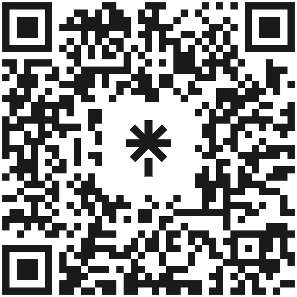
My contact information—phone number and email address are displayed in the lower right-hand corner, and I also included my website address in the documents top and bottom white space. But my second-favorite design element is the QR code I generated using InDesign, which contains an editable embedded link to my website contact form.
The QR tag behaves like a vector image and allows customization of color and size. I chose black to correspond with the document design. Anyone with a mobile device can open the link with a free QR reader app. Others who use a computer or tablet can click on the links I inserted for the text on my domain name and the one I placed in my logo. And if I distribute the one-sheet as a PDF, my links and QR codes (and those of my design clients) are accessible via a click of a mouse. Am I missing something or am I winning on this deal?
After uploading the digital version file to my online repository, I embedded a download link on my website. I can also attach it to emails or other digital communications with prospective clients. And if I need to print it and distribute it via hard copy, this low-cost, one-sheet design has covered my marketing needs.
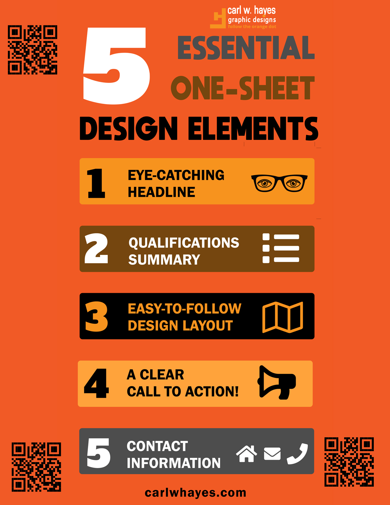
A bonus infographic download
Just for reading this post, I’ve thrown in another infographic to help you remember the design elements discussed above. Enjoy and feel free to republish!
Share This Story!
Related Posts


Almost, everyone from actors to actors to musicians to speakers to authors to small business owners and freelancers of all types use this single-page publicity mechanism to promote themselves in a way a business card cannot.
In this post, I examine what a one sheet is, and five design elements it should include, using one of my own as a reference.
So, what is a marketing one-sheet?
A marketing one sheet, also referred to as a one-pager or a sell sheet, is a single page that provides information about your company or a particular product or service. One-sheets are often printed and distributed during sales meetings or trade shows but can also be posted online or distributed electronically.
Because they are intended to offer a brief, but clear picture (think elevator pitch), it pays to keep text to a minimum and incorporate design elements which are within the bounds of your brand identity.
There are 5 essential design elements
There are a minimum of five essential design elements I recommend for inclusion in every marketing one-sheet.
Although you might be tempted to squeeze in more elements such as testimonials (if your business is new, you might not have any credible ones that will carry weight) remember it’s not a novel but a short, well-designed pitch to generate interest.
Now, let’s examine what should go into each design element.
An eye-catching headline
The headline is the first thing your reader will notice. You’ve only got a few seconds to get to the point: why would I want to use you to do whatever it is you say you do? Get it wrong and you might lose your reader and the chance to schedule a future meeting.
A summary of qualifications/benefits
You’ve either handed or delivered the one-sheet electronically to a prospective customer. What happens next takes place in a matter of seconds. As he reads it, he’ll expect to discover quickly what you are promoting—your product, your service, or yourself—in a series of short descriptive paragraphs, consisting of one to two sentences each. Don’t waste a lot of words, which will waste time and cause readers to lose interest.
An easy-to-follow design layout
A marketing one-sheet must be easy to read and have a logical flow to the information it presents. It should also reflect a professional design touch in your choice of imagery and avoid cheap-looking clip art. Make sure the design reflects your brand identity in color and typeface choices. It doesn’t matter what design program or template you use—Microsoft Word, Canva, PowerPoint, Adobe Express, or others. My personal favorite is InDesign (more on that later).
A clear call to action
Next to the title, this is the most important design element on your marketing one-sheet. You’ll want to lead your prospective customer or client to where you want them to go—visit your website, email you, or call you. Use action words to guide them along the way and offer a solution to a problem. Make sure the call to action stands out from the rest of the design elements.
Contact information
Don’t overlook the importance of your contact information being prominently displayed. At a minimum, you’ll want to be sure and include a phone number, email, and website address, if applicable. If you have a physical location, then include the address.
Dissecting my one-sheet design
So, let’s put theory into practice. I’ll use one of my marketing one-sheets I created using InDesign and analyze the design elements I discussed above.
As I discussed in a previous post, by using InDesign, I have the option of exporting for print and digital without a lot of fuss, saving me valuable time.
click image to view/download larger image
For the sake of putting theory into practice, let’s analyze the marketing one-sheet I created using InDesign. As I discussed in a previous post, using InDesign offers me the option of exporting for print and digital without too much fuss, saving me valuable time.
First, I presented my eye-catching headline in the form of a question/answer with a strong hint of suggestion: KEEP READING.
Next, I summarized my qualifications in three short paragraphs, accompanied by three professional stock photographs to give visual cues to the design services I promoted—graphic design, video production, and content publishing. Each service description includes no more than two sentences. In the white space below the header section and in the footer, I plugged in two snippets describing the quality of my services (Fast Turnaround and Affordable Rates).
My choice of a vertical design layout worked well because it makes it easier to read on paper and on multiple screen sizes. The designs followed a top-to-bottom, left-to-right reading order directing viewers to my call-to-action and my contact information on the document’s right side. It also followed my brand color palette which included shades of orange, black, and white, offering nice contrast for my logo and tagline prominently displayed in the upper right-hand corner.
On this one-sheet, my call to action is prominently featured in a white rectangle which jumps out at the reader against the orange background. Placed beneath my photograph, in two sentences, I empathize with the reader’s dilemma and identify the problem created by needing to act after having thought of a great idea. Next, I offer a solution (“Contact me if you want help solving that problem”).
My contact information—phone number and email address are displayed in the lower right-hand corner, and I also included my website address in the documents top and bottom white space. But my second-favorite design element is the QR code I generated using InDesign, which contains an editable embedded link to my website contact form.
The QR tag behaves like a vector image and allows customization of color and size. I chose black to correspond with the document design. Anyone with a mobile device can open the link with a free QR reader app. Others who use a computer or tablet can click on the links I inserted for the text on my domain name and the one I placed in my logo. And if I distribute the one-sheet as a PDF, my links and QR codes (and those of my design clients) are accessible via a click of a mouse. Am I missing something or am I winning on this deal?
After uploading the digital version file to my online repository, I embedded a download link on my website. I can also attach it to emails or other digital communications with prospective clients. And if I need to print it and distribute it via hard copy, this low-cost, one-sheet design has covered my marketing needs.
A bonus infographic download
Just for reading this post, I’ve thrown in another infographic to help you remember the design elements discussed above. Enjoy and feel free to republish!