Thinking about designing your own book cover?
When author George Eliot coined the first version of the phrase “never judge a book by its cover,” in 1890, he obviously did not have in mind today’s billion-dollar self-publishing industry. A book’s cover, even for nonfiction titles, is a crucial factor in the book’s success.
A lot of designers say you should never design your own book cover. There are also a lot of book publishers who say you should never try to self-publish your work. I’m not saying they are right or wrong, but there are quite a few people who have done both and been successful.
The biggest motivation for a self-publisher to design his own nonfiction book cover, besides wanting to go against the grain, is the cost. A professional cover design can run several hundred dollars on the high end. And even then, there’s no guarantee your book will sell. On the other hand, if you opt for saving money by hiring someone on Fiverr, using a web template, or purchasing a pre-made cover, it might not sell either.
I’m not an expert on book cover design, but I am an avid reader and have a sizeable collection of physical and digital nonfiction titles. For this post, I put my imagination, graphic design, and typography skills to the test with seven conceptual nonfiction covers.
The Sparrow’s Worth
Although most nonfiction titles feature sans-serif fonts, I decided to try a different approach with this conceptual self-help title cover. I chose three Adobe fonts from the Freight Text typeface family for this book which promotes finding happiness in life by changing how you view your own. The varying font sizes and weights blend in seamlessly, giving off an air of professional advice coming from an expert source.

The book title is the focal point of the book cover, so I opted for using a subdued graphic featuring a closeup of a lone sparrow perched on a tree limb during winter. The blurred background gives off a feeling of peaceful solitude and serenity. I split the main title text above and below the bird as the cover’s visual hot spot. I placed the tagline at the top of the book to entice the viewer to want to pick it up and read the back cover for more information.
The Lazy Man’s Cookbook
For this fictional cookbook, I opted for a cover graphic featuring a cellphone-taken photo of a meal I prepared for my wife and I during the pandemic lockdown. Dungeness crab, steak, lobster tail, green beans, and new potatoes is mouth-watering, right? The title and tagline are featured prominently at the top of the page with the author’s name—Will Dolittle—isolated at the bottom hovering over the plate of food.

The shade of orange against the bold white of the Poppins font from Adobe coupled with the black background behind the tagline using the Open Sans font creates a nice contrast and is easy to read. The tagline appeals to the husband who must cook but is unmotivated and yearning for a simple solution so he can get back to lounging.
Home Buying Made Simple
For this real estate advice guide, I chose the easy-to-read Paralucent typeface from Adobe for the multi-colored title text. The tagline text uses the Adelle Sans font, also from Adobe in a pink color against the perfect blue sky and white clouds from the photo I found on Unsplash. I used the green grass as a backdrop for the author’s name at the bottom of the cover.

Using Photoshop, I layered two copies of an image of a hand holding a home, as if out of reach, alongside the title. These images coincide with the book’s claim that the mortgage approval process is a rigged game with the mortgage industry teasing buyers. I also added a second subtitle at the top of cover touting the fact the book contains secret knowledge from an industry insider to pique the curiosity of the would-be first-time homebuyer.
A Book About Nothing
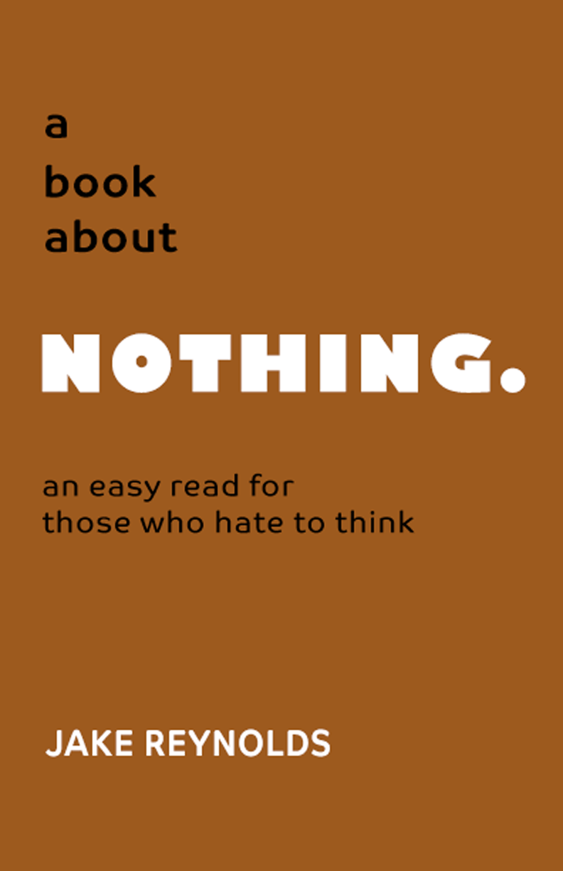
I’m a minimalist at heart. Of my seven designs there’s nothing more minimal than this aptly named concept cover. To draw attention to the cover text, I paired two Adobe fonts—Gil Sans Nova Ultra Bold font and Co Headline Bold. The cover manipulates the vastness of empty space and contrasting typeface sizes to draw attention to NOTHING in the book title.
Red is one of the most popular color choices for nonfiction titles because it appeals to the eye and has a subconscious inference to subject matter of great importance and urgency.
Fear in Action
For this cover I took advantage of the yellow-green shade’s universal association with fear to drive home the point with this self-improvement book. I used capitalized fonts from the Museo Sans typeface family from Adobe to convey its importance. The inverted silhouetted graphic of a man being chased by an angry dog implies the flight caused by things we fear.

I choose to use the white rectangle in the lower portion of the cover to contrast the black text of the tagline advising the reader on how to turn adversity into opportunity.
Stop Hoping It Goes Away
This conceptual self-help book, which also deals with fear, is heavy on implied cliché, i.e., the anomaly of a five-ton elephant in the white room. I juxtaposed its size with lower-case text in the title using the handwritten Adobe font, Uberhand Text Pro Bold, placing it against a dark gray rectangular shape arrangement close in color to the dark part of the elephant’s hide to make increase its legibility. For the subtitle and author name I used fonts from the Acumin font family, also from Adobe.

I located the photos of the elephant and the empty room on Unsplash. Using Photoshop, I removed the white background from the elephant photo, applied a bit of drop shadow, and layered it above the room photo. I also created a reflected image of the elephant and reduced its opacity to give the room floor a shinier look.
Enough With All The Drama!
My final conceptual cover offering is a part-memoir and part-self-help book from the fictional Karen P. Worley, Ph.D. who shares her experiences with dealing with emotional breakdowns. For the graphic I combined one of my favorite humorous stock photos—a screaming, hysterical woman shot from an elevated angle with an anamorphic lens to make her head look larger than her body—with a vector image of a red and white spiral. Using Photoshop, I placed her feet in the center of the spiral which extends of the book edges to add dimension depth.

I used one of my favorite Adobe fonts, Proxima Nova Black for the title, and paired it with Futura PT Heavy for the subtitle and author information at the top of the book. The cover almost makes me dizzy looking at it!
Are you inspired to create your own book cover?
I hope this post serves as inspiration for those of you who want to create your own book cover designs. Like everything else, there are a whole lot of opinions on the web and social media about book cover design. I’m no expert, but I say do your homework and decide if designing your own book cover is something you want to try. You’ll never know unless you do.
One of my favorite sources for self-publishing and book cover design information is book cover designer and marketing expert Derek Murphy. He runs two sites, creativeindie.com and diybookcovers.com. In addition to the paid self-publishing services he provides, Murphy offers lots of free information, including articles and templates to help self-publishers who want to do things for themselves.
Whether you design your own cover or hire a professional, make sure you have clearance to use any artwork, graphics, and especially fonts. The ones featured in this post are included with my subscription to Adobe Creative Cloud and are free for personal and commercial use.
Share This Story!
Thinking about designing your own book cover?
When author George Eliot coined the first version of the phrase “never judge a book by its cover,” in 1890, he obviously did not have in mind today’s billion-dollar self-publishing industry. A book’s cover, even for nonfiction titles, is a crucial factor in the book’s success.
A lot of designers say you should never design your own book cover. There are also a lot of book publishers who say you should never try to self-publish your work. I’m not saying they are right or wrong, but there are quite a few people who have done both and been successful.
The biggest motivation for a self-publisher to design his own nonfiction book cover, besides wanting to go against the grain, is the cost. A professional cover design can run several hundred dollars on the high end. And even then, there’s no guarantee your book will sell. On the other hand, if you opt for saving money by hiring someone on Fiverr, using a web template, or purchasing a pre-made cover, it might not sell either.
I’m not an expert on book cover design, but I am an avid reader and have a sizeable collection of physical and digital nonfiction titles. For this post, I put my imagination, graphic design, and typography skills to the test with seven conceptual nonfiction covers.
The Sparrow’s Worth
Although most nonfiction titles feature sans-serif fonts, I decided to try a different approach with this conceptual self-help title cover. I chose three Adobe fonts from the Freight Text typeface family for this book which promotes finding happiness in life by changing how you view your own. The varying font sizes and weights blend in seamlessly, giving off an air of professional advice coming from an expert source.

The book title is the focal point of the book cover, so I opted for using a subdued graphic featuring a closeup of a lone sparrow perched on a tree limb during winter. The blurred background gives off a feeling of peaceful solitude and serenity. I split the main title text above and below the bird as the cover’s visual hot spot. I placed the tagline at the top of the book to entice the viewer to want to pick it up and read the back cover for more information.
The Lazy Man’s Cookbook
For this fictional cookbook, I opted for a cover graphic featuring a cellphone-taken photo of a meal I prepared for my wife and I during the pandemic lockdown. Dungeness crab, steak, lobster tail, green beans, and new potatoes is mouth-watering, right? The title and tagline are featured prominently at the top of the page with the author’s name—Will Dolittle—isolated at the bottom hovering over the plate of food.

The shade of orange against the bold white of the Poppins font from Adobe coupled with the black background behind the tagline using the Open Sans font creates a nice contrast and is easy to read. The tagline appeals to the husband who must cook but is unmotivated and yearning for a simple solution so he can get back to lounging.
Home Buying Made Simple
For this real estate advice guide, I chose the easy-to-read Paralucent typeface from Adobe for the multi-colored title text. The tagline text uses the Adelle Sans font, also from Adobe in a pink color against the perfect blue sky and white clouds from the photo I found on Unsplash. I used the green grass as a backdrop for the author’s name at the bottom of the cover.

Using Photoshop, I layered two copies of an image of a hand holding a home, as if out of reach, alongside the title. These images coincide with the book’s claim that the mortgage approval process is a rigged game with the mortgage industry teasing buyers. I also added a second subtitle at the top of cover touting the fact the book contains secret knowledge from an industry insider to pique the curiosity of the would-be first-time homebuyer.
A Book About Nothing
I’m a minimalist at heart. Of my seven designs there’s nothing more minimal than this aptly named concept cover. To draw attention to the cover text, I paired two Adobe fonts—Gil Sans Nova Ultra Bold font and Co Headline Bold. The cover manipulates the vastness of empty space and contrasting typeface sizes to draw attention to NOTHING in the book title.

Red is one of the most popular color choices for nonfiction titles because it appeals to the eye and has a subconscious inference to subject matter of great importance and urgency.
Fear in Action
For this cover I took advantage of the yellow-green shade’s universal association with fear to drive home the point with this self-improvement book. I used capitalized fonts from the Museo Sans typeface family from Adobe to convey its importance. The inverted silhouetted graphic of a man being chased by an angry dog implies the flight caused by things we fear.

I choose to use the white rectangle in the lower portion of the cover to contrast the black text of the tagline advising the reader on how to turn adversity into opportunity.
Stop Hoping It Goes Away
This conceptual self-help book, which also deals with fear, is heavy on implied cliché, i.e., the anomaly of a five-ton elephant in the white room. I juxtaposed its size with lower-case text in the title using the handwritten Adobe font, Uberhand Text Pro Bold, placing it against a dark gray rectangular shape arrangement close in color to the dark part of the elephant’s hide to make increase its legibility. For the subtitle and author name I used fonts from the Acumin font family, also from Adobe.

I located the photos of the elephant and the empty room on Unsplash. Using Photoshop, I removed the white background from the elephant photo, applied a bit of drop shadow, and layered it above the room photo. I also created a reflected image of the elephant and reduced its opacity to give the room floor a shinier look.
Enough With All The Drama!
My final conceptual cover offering is a part-memoir and part-self-help book from the fictional Karen P. Worley, Ph.D. who shares her experiences with dealing with emotional breakdowns. For the graphic I combined one of my favorite humorous stock photos—a screaming, hysterical woman shot from an elevated angle with an anamorphic lens to make her head look larger than her body—with a vector image of a red and white spiral. Using Photoshop, I placed her feet in the center of the spiral which extends of the book edges to add dimension depth.

I used one of my favorite Adobe fonts, Proxima Nova Black for the title, and paired it with Futura PT Heavy for the subtitle and author information at the top of the book. The cover almost makes me dizzy looking at it!
Are you inspired to create your own book cover?
I hope this post serves as inspiration for those of you who want to create your own book cover designs. Like everything else, there are a whole lot of opinions on the web and social media about book cover design. I’m no expert, but I say do your homework and decide if designing your own book cover is something you want to try. You’ll never know unless you do.
One of my favorite sources for self-publishing and book cover design information is book cover designer and marketing expert Derek Murphy. He runs two sites, creativeindie.com and diybookcovers.com. In addition to the paid self-publishing services he provides, Murphy offers lots of free information, including articles and templates to help self-publishers who want to do things for themselves.
Whether you design your own cover or hire a professional, make sure you have clearance to use any artwork, graphics, and especially fonts. The ones featured in this post are included with my subscription to Adobe Creative Cloud and are free for personal and commercial use.


