

If you’re trying to build or build a business, a branded social media kit is a marketing tool must-have. Having one allows establishing market presence and recognition across the Internet spectrum. It can also increase your site traffic, sales, and market influence.
A social media kit gives quick access to brand and channel elements. Using one also reduces the time it takes to create posts.
But do you know what goes into one, let alone how to create one? To help you out, I’ll explain what you need and show you what goes into my social media kit for my Instagram account.
What’s in My Instragram Social Media Kit?
A social media kit should contain the following:
• logos and/or profile images
• color palette HEX codes and typography choices
• username, tagline, web address, QR tags, and other aesthetic elements, such as shapes and icons
• layout template files in editable formats (such as Photoshop, etc.)
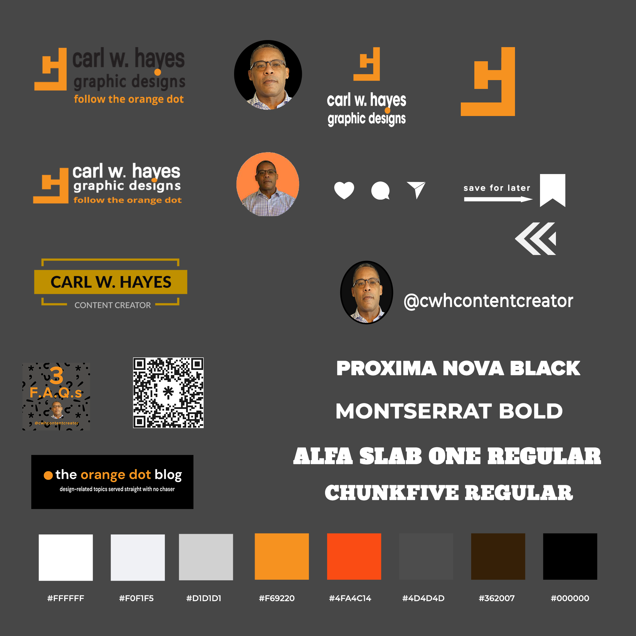
The graphic above displays some of the design elements I use to create posts on Instagram. I save each element as both .PNG (for transparency) and .PSD files (for future editing).
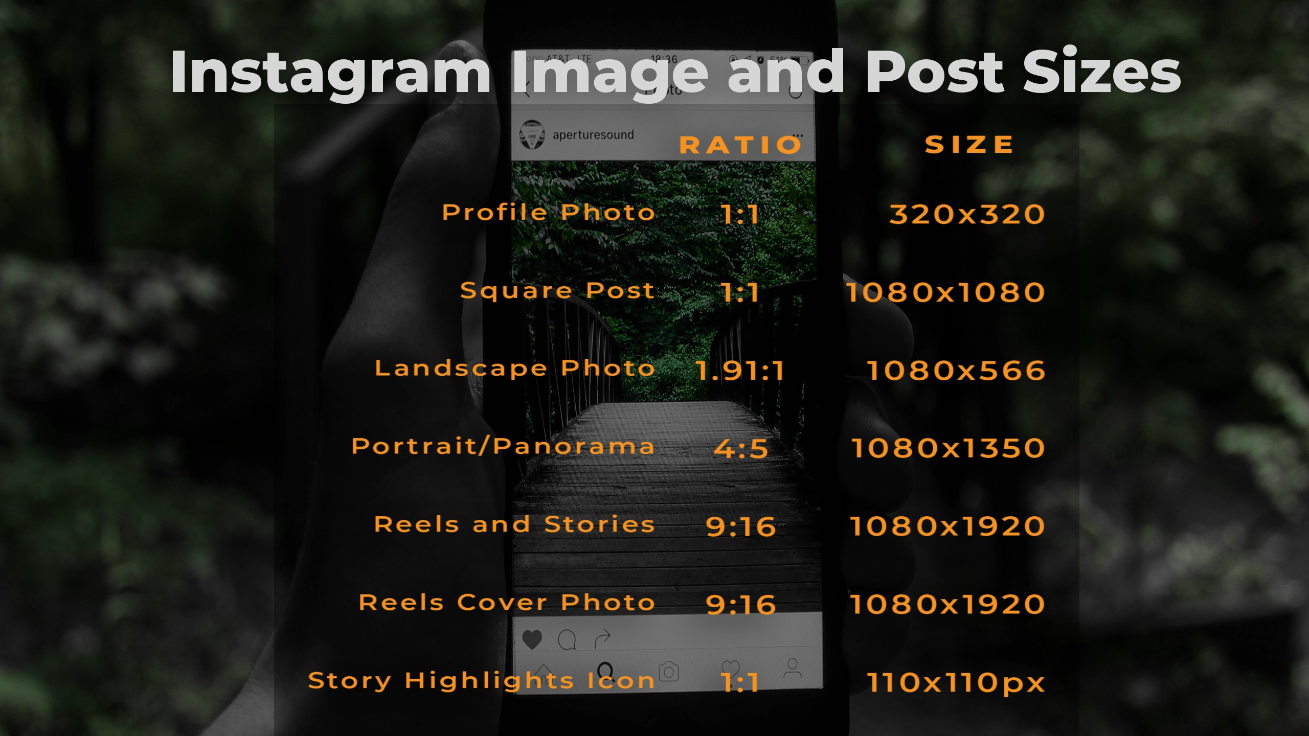
Instagram’s Image/Post Sizes
Like other social media platforms, Instagram has optimal image and post sizes as indicated in the reference chart below.
In this post, I’ll focus on the square, portrait/panorama, and stories/reels post categories. I design most of my images for my posts in Photoshop. For videos I use Premiere Pro or After Effects. Whether you use a Windows PC, a Mac, or use online design tools like Canva and Adobe Express, the principles remain the same.
The Instagram Square Post
Below is an Instagram square post (1080×1080) I designed in Photoshop. Note the presence of the individual design elements: an image with my profile picture and user handle; a Linktree QR tag; an image reminding viewers to like, share and save the post; a gradient background layer; and heading and body text.
Swapping out design elements is easy because I keep them stored in organized subfolders on my computer.


Pictured above is a square post template I customize when I want to let my followers know I’ve written a recent blog article, such as this one. When I decide to use it in the future, I’ll edit the title and change the background image. I might also change the text and shape colors for “New Post” depending on what mood I’m in. In a matter of a few minutes, I’m done and ready to upload my post.
The Instagram Portrait/Panorama Post
Many users upload single portrait photo posts in the 4:5 ratio (1080×1350 px), the maximum size allowed to avoid cropping. The only time I use the portrait/panorama post type is when I want to create an image carousel.
Much like a slideshow, this post can contain multiple photos or videos, which users can view by swiping left on the mobile app. Desktop users can view a carousel post by clicking on the arrow button on the right of a post.
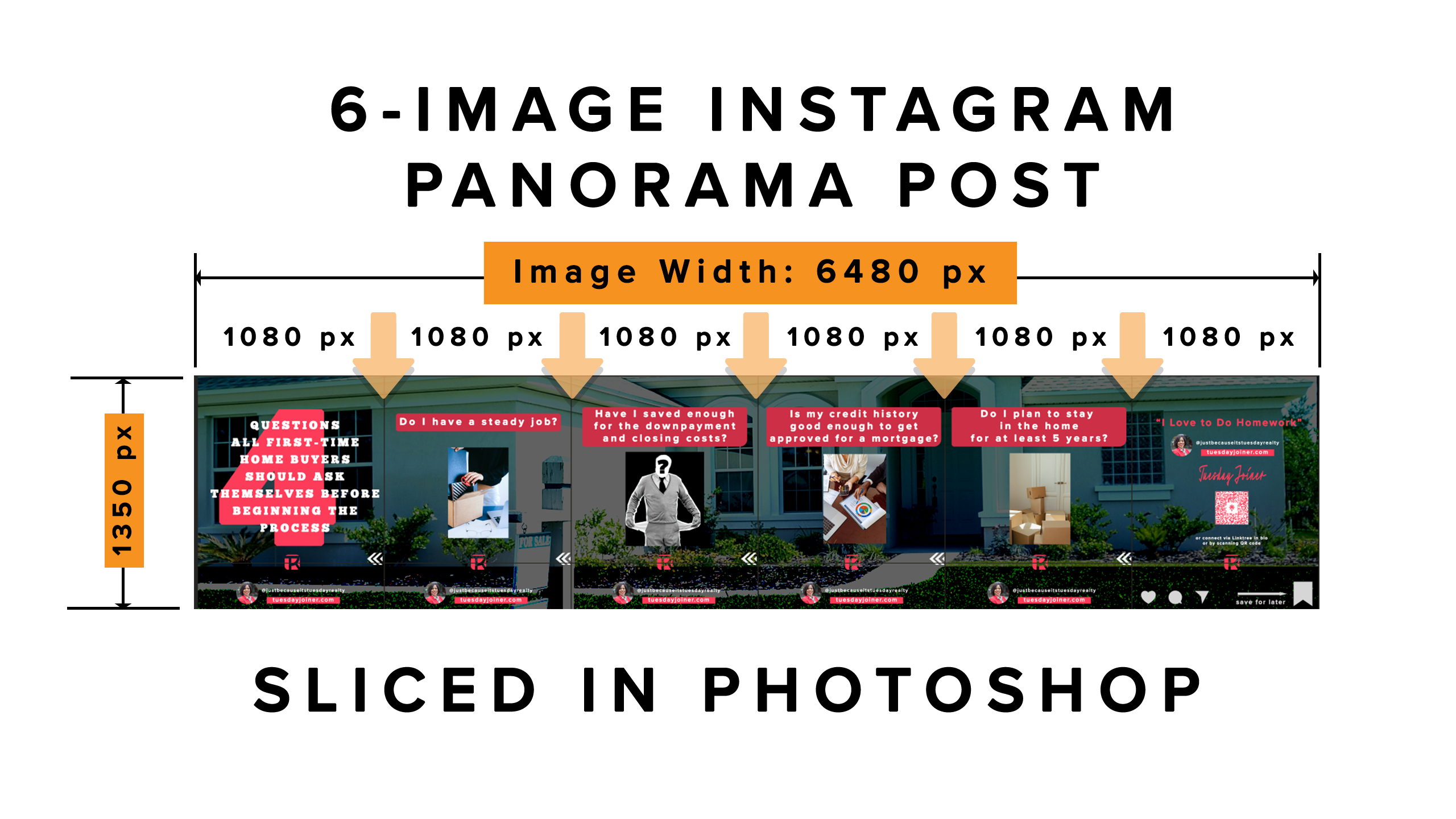
The image above, as created in Photoshop, measures 6480 pixels x 1350 pixels. Photoshop slices it into six individual images measuring 1080 pixels x 1350 pixels. Vertical down arrows represent the slice points.
Using this format requires duplicating placement of design elements—profile photo, logo, and swipe icons—for each slice. I’ve also found it helpful to download a background image (whenever I use one) as large as possible to reduce pixelation. I always save a master version of my different carousels in the Photoshop format for future use.
My personal preference is to insert a dark colored shape layer between the background image and text and adjust its opacity setting to give maximum separation between those elements. Exporting the sliced image will give six individual images which are collectively uploaded to Instagram to create a seamless post.
Note: currently, Photoshop’s maximum image width for a sliced image is 8192 pixels. If you extend the image width to accommodate slice points which exceed 7, Photoshop automatically resizes the image dimensions to keep it within this limit. If you use a Photoshop template with slices exceeding this amount, use the crop tool to reduce the image width to 7 or fewer slices.

For more information read this old post from Jesus Ramirez’s Photoshop Training Channel explaining step by step how to create a seamless panoramic image.
Instagram Reels and Stories
Is there anything better than video for social media content? Although Instagram has recently said it intends to implement a more balanced approach, by far, my favorite Instagram posts are Reels and Stories. Unlike Reels, stories disappear after 24 hours, unless you decide to make them a Highlight.
The optimum ratio layout for both posts is 9:16 (1080 pixels x 1920 pixels) because it fills the screen on mobile devices. But Instagram now treats all video posts as Reels, including square and portrait sizes.


If I’m pressed for time, I might use Adobe Express to create an animated post exported as an MP4 video. But these videos are often only a few seconds in length ranging between 3-7 seconds, much like animated videos created in Photoshop. The problem is Adobe Express exports its video in 720p resolution. I’ll either stretch the video to make it fill the 1080×1920 screen size and run the risk of pixelation, or upscale it in After Effects.
Sometimes I like to create a repeat loop of a short video by duplicating it several times on the editing timeline. The Instagram Story on the promoting my WordPress starter package features this editing technique.
Producing my reels and stories in Premiere Pro or After Effects offers better results and makes it easier for me to add text, transitions, other effects, and audio to my Reels.
Reels Cover Images
It helps to understand how Instagram treats cover image for Reels and Highlights. In the Instagram mobile app, Reels cover photos displayed in the profile grid get cropped to 1:1 (square). In the main Instagram feed, or in someone else’s profile, Instagram crops the Reels cover photo to 4:5. When you click on the Instagram Reels tab, cover images are shown full-size in 9:16 ratio.
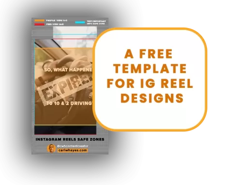
Regardless of what orientation you choose for your Reel post, the primary principle to remember is to keep the key design elements in the center of the square region to make your thumbnail attractive and viewable.
In the image above on the left, note how the main text and image are centered in the center of the square region, denoted by the intersection of the red lines. The supplementary text and other design elements fall into the portrait and full-sized regions. Using Photoshop, I use this template as a guide to help me with my thumbnail layouts. On the right is what the Reels tab looks like on my mobile device.
Instagram gives you the option to select a cover image from a video frame or upload a custom one. What I prefer to do now is to design my thumbnail in Photoshop, import it into Premiere Pro, and insert it at the beginning of my video. When I upload my video to Instagram, I choose that first frame as my cover image.
Story Highlight Icons
When you create a Story post on Instagram, you have the option of preserving it as a Highlight. Accessible through a circular icon, Highlights are added, edited, or removed as desired. I use them to display current information about me, my services, to answer frequently asked questions, to promote my blog, or to shine the spotlight on one of my current design promotions.
Instagram crops each Highlights cover image to a 110×110 square pixel icon. Designing them in larger pixel dimensions in Photoshop is possible if I keep the same image proportions. As an example, I designed a Highlights cover image for an Instagram Highlight in Photoshop at 550 square pixels. The enlarged image on the right displays the icon on the Highlights mobile menu bar reduced to 110 pixels.
Get Started Building Your Social Media Kit
Creating a custom social media kit for each of your social media channels is the way to go if you want to boost your brand awareness. By organizing the separate design elements as individual files in a master directory, and utilizing master templates, you’ll spend less time creating content.
Even if you’re not comfortable using Photoshop and prefer to use online tools like Adobe Express or Canva, you’ll still need to have your logos, color palette, fonts, and other design elements stored somewhere to keep your branding consistent.
So, what are you waiting for?
Share This Story!
Related Posts
If you’re trying to build or build a business, a branded social media kit is a marketing tool must-have. Having one allows establishing market presence and recognition across the Internet spectrum. It can also increase your site traffic, sales, and market influence.
A social media kit gives quick access to brand and channel elements. Using one also reduces the time it takes to create posts.
But do you know what goes into one, let alone how to create one? To help you out, I’ll explain what you need and show you what goes into my social media kit for my Instagram account.
What’s in My Instragram Social Media Kit?
A social media kit should contain the following:
• logos and/or profile images
• color palette HEX codes and typography choices
• username, tagline, web address, QR tags, and other aesthetic elements, such as shapes and icons
• layout template files in editable formats (such as Photoshop, etc.)
The graphic above displays some of the design elements I use to create posts on Instagram. I save each element as both .PNG (for transparency) and .PSD files (for future editing).
Instagram’s Image/Post Sizes
Like other social media platforms, Instagram has optimal image and post sizes as indicated in the reference chart below.
In this post, I’ll focus on the square, portrait/panorama, and stories/reels post categories. I design most of my images for my posts in Photoshop. For videos I use Premiere Pro or After Effects. Whether you use a Windows PC, a Mac, or use online design tools like Canva and Adobe Express, the principles remain the same.
The Instagram Square Post
Below is an Instagram square post (1080×1080) I designed in Photoshop. Note the presence of the individual design elements: an image with my profile picture and user handle; a Linktree QR tag; an image reminding viewers to like, share and save the post; a gradient background layer; and heading and body text.
Swapping out design elements is easy because I keep them stored in organized subfolders on my computer.
Pictured above is a square post template I customize when I want to let my followers know I’ve written a recent blog article, such as this one. When I decide to use it in the future, I’ll edit the title and change the background image. I might also change the text and shape colors for “New Post” depending on what mood I’m in. In a matter of a few minutes, I’m done and ready to upload my post.
The Instagram Portrait/Panorama Post
Many users upload single portrait photo posts in the 4:5 ratio (1080×1350 px), the maximum size allowed to avoid cropping. The only time I use the portrait/panorama post type is when I want to create an image carousel.
Much like a slideshow, this post can contain multiple photos or videos, which users can view by swiping left on the mobile app. Desktop users can view a carousel post by clicking on the arrow button on the right of a post.
The image above, as created in Photoshop, measures 6480 pixels x 1350 pixels. Photoshop slices it into six individual images measuring 1080 pixels x 1350 pixels. Vertical down arrows represent the slice points.
Using this format requires duplicating placement of design elements—profile photo, logo, and swipe icons—for each slice. I’ve also found it helpful to download a background image (whenever I use one) as large as possible to reduce pixelation. I always save a master version of my different carousels in the Photoshop format for future use.
My personal preference is to insert a dark colored shape layer between the background image and text and adjust its opacity setting to give maximum separation between those elements. Exporting the sliced image will give six individual images which are collectively uploaded to Instagram to create a seamless post.
Note: currently, Photoshop’s maximum image width for a sliced image is 8192 pixels. If you extend the image width to accommodate slice points which exceed 7, Photoshop automatically resizes the image dimensions to keep it within this limit. If you use a Photoshop template with slices exceeding this amount, use the crop tool to reduce the image width to 7 or fewer slices.
For more information read this old post from Jesus Ramirez’s Photoshop Training Channel explaining step by step how to create a seamless panoramic image.
Instagram Reels and Stories
Is there anything better than video for social media content? Although Instagram has recently said it intends to implement a more balanced approach, by far, my favorite Instagram posts are Reels and Stories. Unlike Reels, stories disappear after 24 hours, unless you decide to make them a Highlight.
The optimum ratio layout for both posts is 9:16 (1080 pixels x 1920 pixels) because it fills the screen on mobile devices. But Instagram now treats all video posts as Reels, including square and portrait sizes.
If I’m pressed for time, I might use Adobe Express to create an animated post exported as an MP4 video. But these videos are often only a few seconds in length ranging between 3-7 seconds, much like animated videos created in Photoshop. The problem is Adobe Express exports its video in 720p resolution. I’ll either stretch the video to make it fill the 1080×1920 screen size and run the risk of pixelation, or upscale it in After Effects.
Sometimes I like to create a repeat loop of a short video by duplicating it several times on the editing timeline. The Instagram Story on the promoting my WordPress starter package features this editing technique.
Producing my reels and stories in Premiere Pro or After Effects offers better results and makes it easier for me to add text, transitions, other effects, and audio to my Reels.
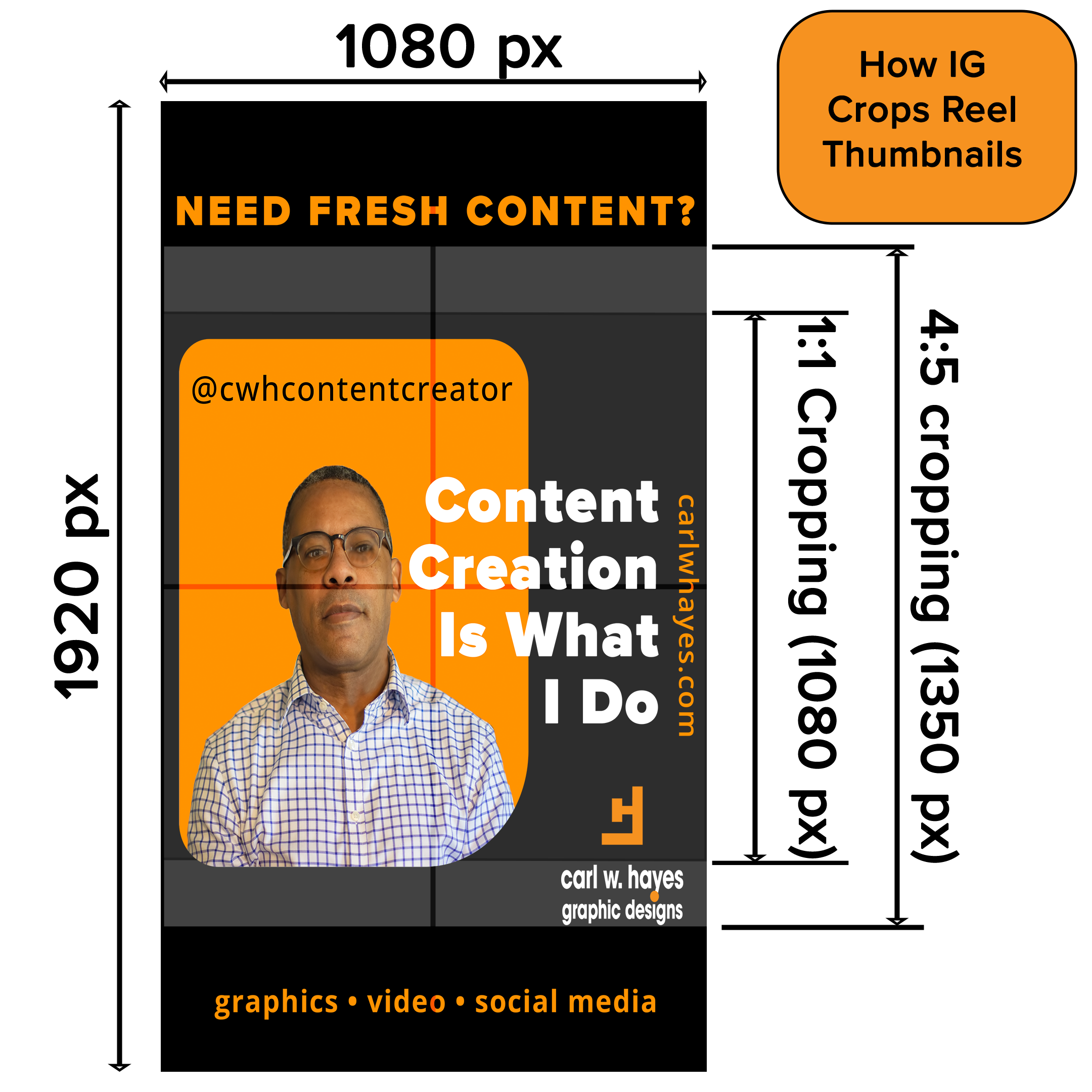
Reels Cover Images
It helps to understand how Instagram treats cover image for Reels and Highlights. In the Instagram mobile app, Reels cover photos displayed in the profile grid get cropped to 1:1 (square). In the main Instagram feed, or in someone else’s profile, Instagram crops the Reels cover photo to 4:5. When you click on the Instagram Reels tab, cover images are shown full-size in 9:16 ratio.
Regardless of what orientation you choose for your Reel post, the primary principle to remember is to keep the key design elements in the center of the square region to make your thumbnail attractive and viewable.
In the image above on the left, note how the main text and image are centered in the center of the square region, denoted by the intersection of the red lines. The supplementary text and other design elements fall into the portrait and full-sized regions. Using Photoshop, I use this template as a guide to help me with my thumbnail layouts. On the right is what the Reels tab looks like on my mobile device.
Instagram gives you the option to select a cover image from a video frame or upload a custom one. What I prefer to do now is to design my thumbnail in Photoshop, import it into Premiere Pro, and insert it at the beginning of my video. When I upload my video to Instagram, I choose that first frame as my cover image.
Story Highlight Icons
When you create a Story post on Instagram, you have the option of preserving it as a Highlight. Accessible through a circular icon, Highlights are added, edited, or removed as desired. I use them to display current information about me, my services, to answer frequently asked questions, to promote my blog, or to shine the spotlight on one of my current design promotions.
Instagram crops each Highlights cover image to a 110×110 square pixel icon. Designing them in larger pixel dimensions in Photoshop is possible if I keep the same image proportions. As an example, I designed a Highlights cover image for an Instagram Highlight in Photoshop at 550 square pixels. The enlarged image on the right displays the icon on the Highlights mobile menu bar reduced to 110 pixels.
Get Started Building Your Social Media Kit
Creating a custom social media kit for each of your social media channels is the way to go if you want to boost your brand awareness. By organizing the separate design elements as individual files in a master directory, and utilizing master templates, you’ll spend less time creating content.
Even if you’re not comfortable using Photoshop and prefer to use online tools like Adobe Express or Canva, you’ll still need to have your logos, color palette, fonts, and other design elements stored somewhere to keep your branding consistent.
So, what are you waiting for?