


Worry less about “branding” and more about consistency
People like using buzzwords.
“Branding” seems to be one they’re especially fond of these days. Designers, marketers, and advertisers use it. Corporations use it. Entertainers, athletes, and social media influencers all use it.
One would think there is some mystical power within the word itself—as if by simply uttering it over and over, success is all but guaranteed.
Don’t get caught up in the hype but do give serious thought about how your business is presented to the public.
1. Start with the logo design
Whether you hire someone to design your logo or you do it yourself, use vector design software such as Adobe Illustrator to make it easier to export different versions of the logo in varied sizes, colors, and file formats for different applications.
“The role of the logo is to point, to designate—in as simple a manner as possible…what it means is more important that what it looks like.” – Paul Rand
The best logo designs are ones which endure the test of time, despite trends that come and eventually fade. They share the following characteristics:
2. Choose the right type
Like the logo, your choice of a typeface and fonts will play a critical role in conveying a specific attitude and evoking certain feelings from the viewing audience. But there are a few things you’ll need to understand and do to get it right:
Typography: the art and technique of arranging type to make written language legible, readable, and appealing when displayed.-Wikipedia
3. Choose a color scheme
An effective visual identity includes color harmony—choices and combinations which engage the viewer and evoke feelings of acceptance and balance. Our eyes are drawn toward “warmer” colors and soothed by “cooler” colors.
“All colors are the friends of their neighbors and the lovers of their opposites.”– Marc Chagall
There are four primary methods of achieving color harmony:

source: macrovector - freepik.com
Even if you don’t understand color harmony, there’s no need to worry.
Creating a color scheme has never been easier with online tools such as Coolors, Dopely, or Adobe Color. It’s worth the time it takes to experiment with generating color palettes using different harmony methods, view palettes created by other users, or save the values in the color space needed for your design—usually RGB for screen display or CMYK for print.
4. Use high-quality photography and graphics for marketing campaigns
When it comes to photographic images and graphics to market your small business, use the highest-quality ones you can find.
There are several well-known platforms for obtaining stock imagery. Unsplash and Pexels are two popular sites for royalty-free photography. And there are numerous premium image sites, such Shutterstock, iStock, Can Stock Photo, and Adobe Stock, who charge—sometimes handsomely—for their digital assets.
Whichever route you take, remember these points:

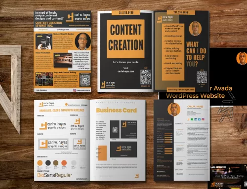
5. Use a style guide to keep things consistent
Once you’ve finalized your visual identity, it’s smart to create a visual style guide.
Visual style guides define the way the visual assets will look and keep corporate graphics consistent and uniform in marketing materials, on websites, and social media platforms. This guide also includes typography details about fonts.
It can be as simple as one sheet or a multi-page manual. After the original visual identity is created the style guide is updated as needed.

Share This Story!
Related Posts


Worry less about “branding” and more about consistency
People like using buzzwords.
“Branding” seems to be one they’re especially fond of these days. Designers, marketers, and advertisers use it. Corporations use it. Entertainers, athletes, and social media influencers all use it.
One would think there is some mystical power within the word itself—as if by simply uttering it over and over, success is all but guaranteed.
Don’t get caught up in the hype but do give serious thought about how your business is presented to the public.
1. Start with the logo design
Whether you hire someone to design your logo or you do it yourself, use vector design software such as Adobe Illustrator to make it easier to export different versions of the logo in varied sizes, colors, and file formats for different applications.
“The role of the logo is to point, to designate—in as simple a manner as possible…what it means is more important that what it looks like.” – Paul Rand
The best logo designs are ones which endure the test of time, despite trends that come and eventually fade. They share the following characteristics:
2. Choose the right type
Like the logo, your choice of a typeface and fonts will play a critical role in conveying a specific attitude and evoking certain feelings from the viewing audience. But there are a few things you’ll need to understand and do to get it right:
Typography: the art and technique of arranging type to make written language legible, readable, and appealing when displayed.-Wikipedia
3. Choose a color scheme
An effective visual identity includes color harmony—choices and combinations which engage the viewer and evoke feelings of acceptance and balance. Our eyes are drawn toward “warmer” colors and soothed by “cooler” colors.
“All colors are the friends of their neighbors and the lovers of their opposites.”– Marc Chagall
There are four primary methods of achieving color harmony:
source: macrovector - freepik.com
Even if you don’t understand color harmony, there’s no need to worry.
Creating a color scheme has never been easier with online tools such as Coolors, Dopely, or Adobe Color. It’s worth the time it takes to experiment with generating color palettes using different harmony methods, view palettes created by other users, or save the values in the color space needed for your design—usually RGB for screen display or CMYK for print.
4. Use high-quality photography and graphics for marketing campaigns
When it comes to photographic images and graphics to market your small business, use the highest-quality ones you can find.
There are several well-known platforms for obtaining stock imagery. Unsplash and Pexels are two popular sites for royalty-free photography. And there are numerous premium image sites, such Shutterstock, iStock, Can Stock Photo, and Adobe Stock, who charge—sometimes handsomely—for their digital assets.
Whichever route you take, remember these points:
5. Use a style guide to keep things consistent
Once you’ve finalized your visual identity, it’s smart to create a visual style guide.
Visual style guides define the way the visual assets will look and keep corporate graphics consistent and uniform in marketing materials, on websites, and social media platforms. This guide also includes typography details about fonts.
It can be as simple as one sheet or a multi-page manual. After the original visual identity is created the style guide is updated as needed.